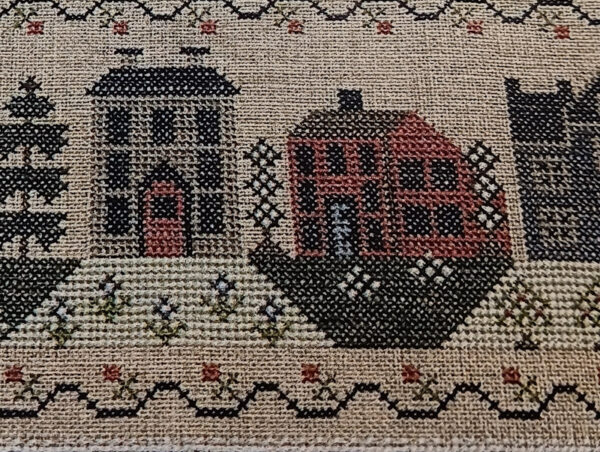
Yesterday I mentioned I was going to finish stitching the row of houses, then start on the row of trees.
This is not a complaint so please don’t take it as such. The A Changed World chart calls for Au Ver A Soie 100/3 Silk but it also has a DMC conversion. I had never used 100/3 when I started this project and this project is stitched on 36 count. I have used it now and prefer to use 100/3 on 40 or higher count so I ordered a conversion to Soie d’Alger. I ordered it from a shop that I no longer will order from. I’ve only placed three or four orders with them and all had issues.
But, when I stitched the red flowers the other day, I thought . . they are so bright! Then when I stitched the red door yesterday, it also seemed really bright. Last night I got ready to start stitching the next house, which is red and I was expecting it to be a burgundy red but nope, it’s this same bright red. I looked online, and it’s hard to tell sometimes about the online pictures, but the 100/3 red looks to be a deeper, darker, brownish, older looking red.

This is a photo of the picture on the cover and that red looks nothing like the red I have. Also, the green underneath the red door is kinda in your face too where the green called for is more of a tan celery color.

I would not want to be the one decided on conversions for someone else but I use Victoria Clayton’s conversions all the time and they are always exact or close enough to exact that I can’t notice a difference.
I don’t have a Soie d’Alger stash but I did have a good red in NPI silks and started the house with that but NPI is a bit thinner than Soie d’Alger, and it was noticeable on the 36 count linen, and I didn’t want the red house to be the only thing on the piece that looked like it had thinner thread so I got online and ordered six different Soie d’Alger reds. Surely one of those will work but I won’t have them before August 1 so I’ll work on the tree row til the end of July. Then I’ll work on my August 1 project and A Changed World will come up again on August 6. The floss should be here by then.
I’m fine stitching the trees first. Should I get them all done (I won’t), I could always stitch the area underneath the red house and the bright green on the right side of that area and even the fourth house and go back and stitch the third house when the other reds arrive.
There’s a small chance this piece will be finished even in August so this isn’t slowing me down but it is a bit weird that the red and the bright green both seem so far off from the called for colors.

Tracy says
-I used DMC for this, and the red was 817, it is more of an orangey red, but not quite as bright as the silk color you used/got. Also, the finished piece photograph on my copy of the pattern seems a little washed out when compared to the actual stitchery. Take a look at Jo’s, at Jo’s country junction, https://www.joscountryjunction.com/cross-stitch-update-38/. Her finished piece photos are pretty true to color. What ever color you choose though, has to look right to you
judy.blog@gmail.com says
I was calling what I thought the red should look like as more of a burgundy brownish red and Jo’s does look more like my cover of the chart. The bright green and red I received just don’t go with it, in my opinion.
Susan Nixon says
My opinion, which counts for nothing because I barely do regular small XS and not much of that, is that those colors are all wrong and that green looks awful and out of place. The other colors look okay. I would not be happy with that shop at all!
judy.blog@gmail.com says
This kit was probably the first think I’ve ordered from them and, of course, it was two years before I used those two colors. I think I’ve ordered two more things from them through the years and haven’t been happy with them so I’m done with ordering from them.
Catherina says
I love the green, looks very fresh and springlike! But the red is just too bright. I think you will end up with something special.