It’s a good thing I love this project because if this was one I just halfway loved, I would long since have given up.
I think I’m ready to make a decision on the color for the house. Please feel free to tell me what you think.
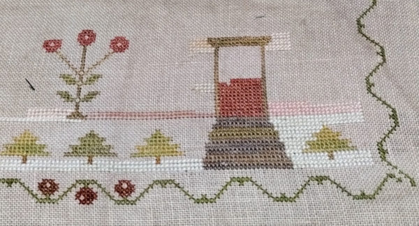
First, I know there’s a row left off the top left flower. I ran out of floss and went back to working on the house color decision.

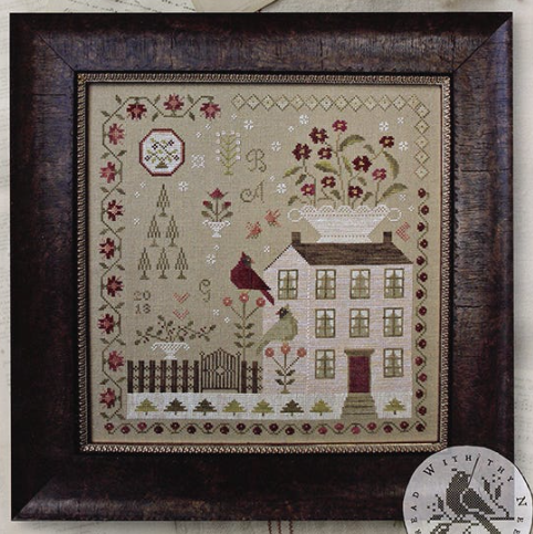
There’s a photo of the cover of the chart, Winter Rose Manor. You can see that the house is somewhat pinkish.

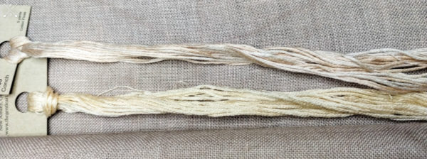
The very nature of overdyed floss is that there are often variations in color . . sometimes so much so that one skein doesn’t look anything like another skein of that same color. Conch is an good example of that and it is one of my least favorite colors because of that.
Let’s start at the left side of the door, about midway down, where the red door color stitching has stopped. That is the called for color, Conch. My skein is almost totally yellowish off white.

The skein at the top is the Conch I have and the skein at the bottom is a yellowish-off white. There’s not much peach/pink in my skein of Conch at all.
I kept digging and digging and finally found another skein of Conch that does have a bit more peachy color in it, but still too much off white. On the top left of the door, I used the second skein of Conch. I would like it ok if the skein wasn’t so variegated. There’s so much almost white in this skein.
On the bottom left side of the door, on the right side of the blooming plant, that’s Sanguine. I had high hopes for that color but I believe it’s too rosy. As the stitching for the house goes up, it’s going to be right next to those flowers and I think the flowers will fade into the house, which sometimes happens in real life but I think I can find something better.
On the bottom right, just above the snow is “Limited Edition” by Colour & Cotton. I do like it.
On the top right side of the door is Cameo Pink by The Gentle Art. I do like it. On the left side of the blooming plant, I stitched more of the snow, and stitched some more rows in Cameo Pink to see how it would look next to the snow. I didn’t want it to blend in. I want to see where the house ends and the snow begins.
I really appreciate your thoughts. I want this piece to be beautiful and I don’t want to wish I had stitched the house in a different color.
Thanks for your input.

Donna Williams says
My vote is for Cameo Pink, if I understand correctly that is the one to the top right bof the door. That said, it’s your piece so do what makes you happy.
Liz says
I like the pink on the right bottom. On the left side, did you forget about the one pale line that goes up to show the edge of the house? I’m dealing with the edge and grout issues on my current piece.
Also, there are windows to consider. There is an outline, curtains, and the background. How do those three colors interact with the proposed brick color?
judy.blog@gmail.com says
I’m not sure what bricks you’re talking about. The window trim, which will be next to the pink is the same color as the door trim. That’s why I stitched the outline of the door . . to see how it would look with the house color. The curtains/glass isn’t going to matter because the outer trim of the windows is between the pink and the curtains/glass.
The line for the edge of the house, as far as I can tell, is back stitched after the rest of the stitching is done.
Pat Anderson says
I do like the Cameo Pink, but I think I like the one below it more. Either will be beautiful though!
Pat D says
I like the Limited Edition (bottom right). The Cameo just looks like another shade of white on my computer, but I know it could look completely different in person.
judy.blog@gmail.com says
It probably has more to do with my bad picture taking and the lighting in the basement. 🙂 You’re correct though. In better daylight, it is kinda light.
Elaine says
I reckon I’d give up ! Try green or blue! I’m sure it will look wonderful when you do more of your choice Judy, I don’t think tiny patches give a clear impression of what a larger piece will look like. Choose a colour you like no matter what the pattern suggests, you’ll like it. All the best, Elaine
judy.blog@gmail.com says
I would go to bed each night thinking I’d just make it a purple house but it was the pink house that first made me fall in love with this chart.
justquiltin says
Well you know I’m not fond of pink but I really really like the Limited Edition and think it would make a lovely house. Also think it looks good with your door color.
judy.blog@gmail.com says
That’s the one Vince chose too.
Dotti says
Bottom left of door or bottom right would both look good! There is so much white they would please you, I’m sure.
Donnalyn says
I am thinking that the Cameo Pink looks closest to the color in the original picture. I do like the Limited Edition, but will it be too pink when the whole house is stitched? So when all is said and done pick the one you like best!! Good Luck!
Tracy says
-What if you used two colors? I like the “limited edition” tone, would you try that for the under cross, and then the pink-er conch for the upper cross?
Marie L. says
Your choice is what matters. I am another vote for Limited Edition. I like the color and contrast with the snow.
Cindy F says
I’m also going to say Limited Edition. In the photo there doesn’t seem to be enough contrast between Cameo and the snow unless there are darker parts of Cameo that aren’t stitched.
JackiesStitches says
You could always stitch one leg of the X with one color and the other leg with another. I’ve heard some stitchers are doing that in an attempt to darker up their conch a little big.
judy.blog@gmail.com says
I hadn’t thought of that.
Sandi B says
Of all you’ve shown, I like Limited Edition best.
Julie A Thomas says
I like the bottom right color. I think you said it was the limited edition color.
Sue Mettler says
I am using Classic Colorworks Perfect Piecrust. I am think I am using a Natural colored linen. Not sure what it was. I really like the color, not too pink and not too light. I also think I am omitting the snow. I would like to leave it up all year long. Good Luck with your Winter Rose Manor.
judy.blog@gmail.com says
I tried Perfect Piecrust. It was just a bit too light for my fabric but I had been hopeful it would work.