I know I said I wouldn’t . . but I did! Just hear me out . . I have a very good excuse (but I always do!).
Last night I was watching Fox & Rabbit Flosstube #18. I could almost be sure I’ve seen about 30 of their flosstubes so how can it only be #18?? I really like them. In so many ways they remind me of Vince and me. He doesn’t smile much. He seems to get aggravated at her for talking non-stop. She buys everything. She’s so enthusiastic and could probably talk all night. She giggles and best of all . . none of his grumbling and yawning and frowning seems to bother her at all!

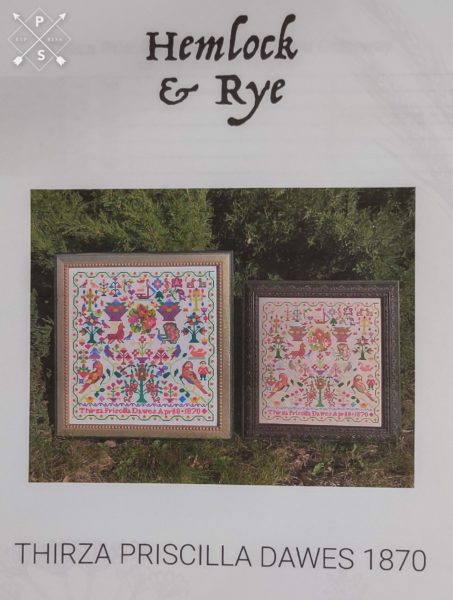
But, they showed a new chart by a new designer. The chart is Thirza Priscilla Dawes 1870 and it is charted in a bright colorway (from the way the colors are on the back side where they have not been faded by the sun) and in an “aged” colorway (from the colors on the front side where the sun has faded them). Do not judge by the picture shown above because my printer is low on ink and I didn’t want to “borrow” someone else’s picture from the internet.
What caught my attention was all the motifs. I love that it has so many. It’s a bit “over the top” with motifs and probably if I ever created a sampler, it would be full of birds and people and dogs and cats and flowers so this sampler made me smile.
I’m going to do the aged version, though my heart wanted me to do the bright version but it would be a bit out of place with the antique samplers I hope to stitch. It does call for all DMC. The aged version is stitched on 40 count Saltbush by Fox & Rabbit. That’s one of those colors that’s impossible to find right now and I knew I had a piece in my stash but I bought it for something else but . . it appears I bought it twice. That could have been because I figured it was going to be in high demand and show up in lots of charts or it could have been purely accidental but I have two pieces so I can stitch this on the called for fabric and still have enough for the other piece I had planned to stitch using Saltbox.
I think Brendon plans to start his on May 1. I’m not sure when I’ll start mine but I’d like to be stitching along with others so we’ll see if I can work it in.

Roberta says
Do it in the bright colors, just put in a different room or wall. Won’t matter and really that is the antique colors how they were stitched. Not how the faded.
Liz says
I like the bright color one since it is showing what the true colors at the time. And, it looks like the faded colors are just too similar to the fabric – the blues are basically missing. I think you will unhappy with the result.
And, it reminds me of your quilts that are so bright and cheery. You may find some other samplers that are done in brighter colors to add to your wall.
Follow your heart
judy.blog@gmail.com says
I think my tastes have moved away from the brights. I’ll lay it all out and sub any colors that don’t show up.
justquiltin says
I think it seems like they have done more flosstubes because theirs are longer than most of the ones I watch but they are so entertaining! The good thing about it being jam packed with motifs is it will make it so much easier to count from one to the next without a lot of open space in between. If I were stitching it myself I’d do the aged version as the bright version is a bit garish for my own personal tastes. Looking forward to watching your progress on this. Are you joining their Zoom stitching event for this?
judy.blog@gmail.com says
Not joining in the Zoom. I’ll leave those spaces for the famous stitchers. I agree about the bright version. I think I’ll be much happier with the aged version.