My taste in color is or has definitely changed but there seems to be a disconnect somewhere. I almost always go for the bright colors and then, one by one, switch them out for more muted colors. It’s that way with cross stitching, with my clothes, with the rugs I bought. My color choices probably still seem a bit garish to some but considering what I chose 20 years ago . . I’m toning it down.
Before Vince and I were married, he lived in Georgia and I lived in southwest Louisiana. We would meet often in Destin. It was about a 6 hour drive for each of us. For us to fly to visit each other, he would have to drive 2 hours to Atlanta to fly out or to pick me up and I would have to drive 2-1/2 hours to Houston to fly out or pick him up so driving to Florida was about as quick and easy as flying.
One night we were in Destin and had gone to eat and we were sitting outside in an area that resembled a tropical garden. I had on a lime green outfit with lime green shoes and this tiny little lime green lizard hopped up on our table and was looking at me. Vince said “Momma?” in a wee little voice . . insinuating that the lizard thought I was his mother because of the color of my clothes.
Anyway . . I’m working on Key to My Heart. These are the colors I originally chose.
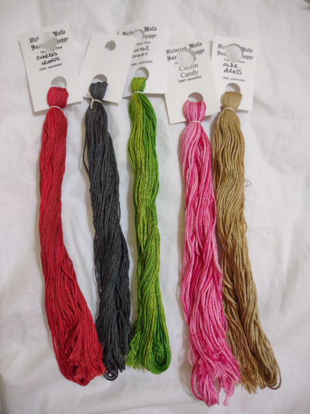
They look fine there, or they did that day. After having stitched what’s shown below, the green was way too bright so I ran downstairs and chose a not so bright green.
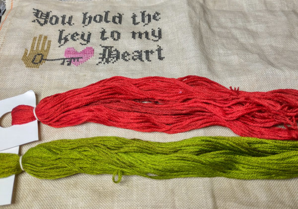
Then that made the red look too bright so I began looking at reds. The more reds I pulled, the more I didn’t like the new green. It was pretty easy to switch out the green for Classic Colorworks’ English Ivy but the red . . not so easy because the flower has red and pink together.
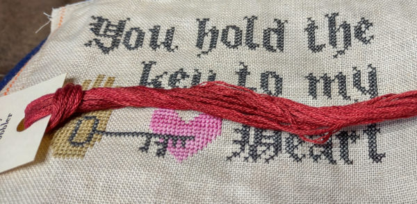
This is Classic Colorworks’ Cherry Cobbler and I think it’s too orange with that pink, though it’s never looked orange to me before. It’s amazing how different colors can look depending on their surroundings.
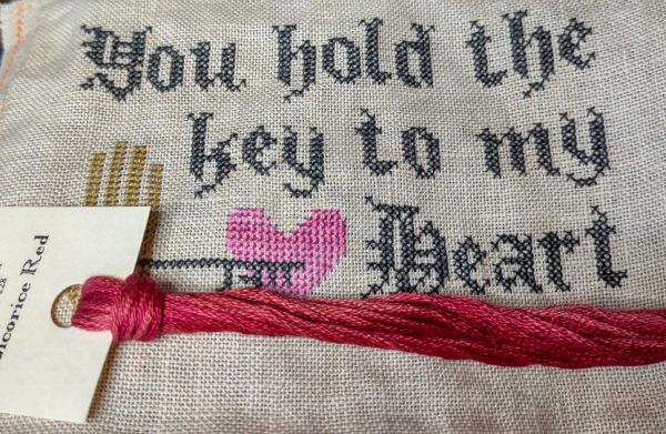
This one is Licorice Red by Classic Colorworks and while I like it, I don’t think it goes so great with that pink.
Below is Weeks’ Brick and I think it goes well with English Ivy and the pink. If I had it to do over again, I’d use a different pink and I could use a different pink for the flower but I’m sticking with this.
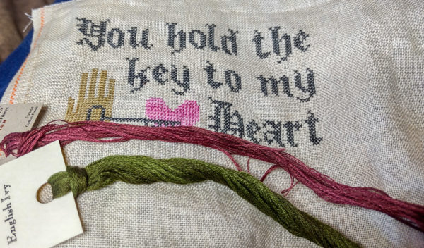
You know what they say . . done is better than perfect. I think it will be fine with these new colors.

Ruth Chow says
LOL “Mama?” Thanks for the laugh, Vince!
Sandi B says
Aye, Vince! I nearly spit you coffee out!!
Sandi B says
*my (not you! Autocorrect!!)
judy.blog@gmail.com says
I knew what you were thinking. Autocorrect on my phone drives me nuts . . it isn’t so bad on the Chromebook but maybe it’s turned off or something. Sometimes the phone is determined to put in what it wants to put.
Cindy F says
That Vince comment made me laugh out loud!!
Dottie+Newkirk says
LOL – Vince’s “momma” comment sure made me smile!
Rebecca says
I believe I remember a comment of “clown colors”!! from your dear one.
judy.blog@gmail.com says
Yes. That’s exactly the phrase he used to describe my taste in colors.