
The floss I ordered to try for the background arrived today.
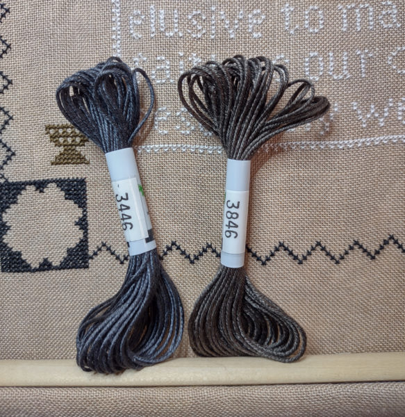
When I ordered it, I was afraid the one on the right, 3846, was going to be too brown.
Here they both are on a black tablet.
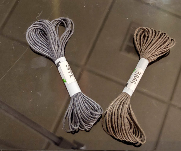
They both look so much lighter on the blac background and the 3846 really looks tan. The first picture is way more accurate but when I pull out one strand, they will both probably be way lighter.
Looking at the two skeins separately, I think I’m going to go with 3846, the browner one.
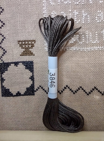
My thinking is that the fabric is tan, the vases on each side of the text box are brown and I think 3846 is just a bit softer than the 3446.
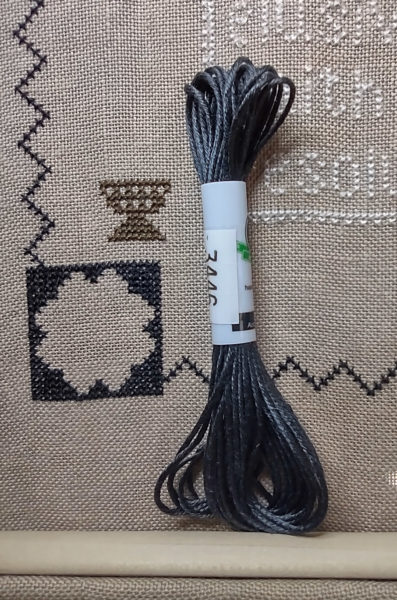
Here’s 3446 by itself just for comparison.
Thoughts?
Laura says
I prefer the warmer look of 3846.
There should be some lovely xstitch available that feature pumpkins, colored leaves, apples & pies, cocoa, trees losing leaves.
Shauna Trueblood says
I agree with you the 3846 looks better to me. I think it is the brown tone against the fabric that I like, but it looks softer, less harsh. The other isn’t bad, but I think I would choose the same as you.
Rebecca says
It’s unanimous (so far).