One last post on whether to change the color of the dates – I realize the dates are almost as important as my uncle’s name but I think some of of us are of the mindset (and that may not be the right word), that everything has to be easy to see. I seem to like things that you may not notice at first glance. Sometimes my favorite flowers in a bed are the ones you have to almost move others out of the way to see. I think that adds interest.

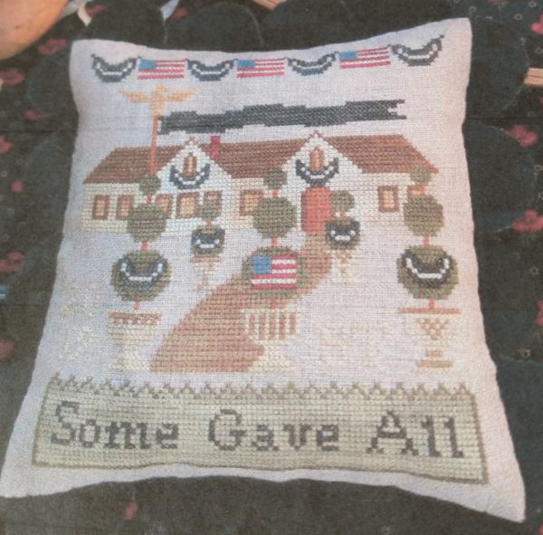
This is the cover shot of this project. You have to really look to see the date it was stitched (to the left of the pot on the left) and her initials (to the left of the pot on the right).
I’ve found with cross stitching, especially in the more modern designs, there are a lot of stitches that are blended into either the background or other areas of stitching.

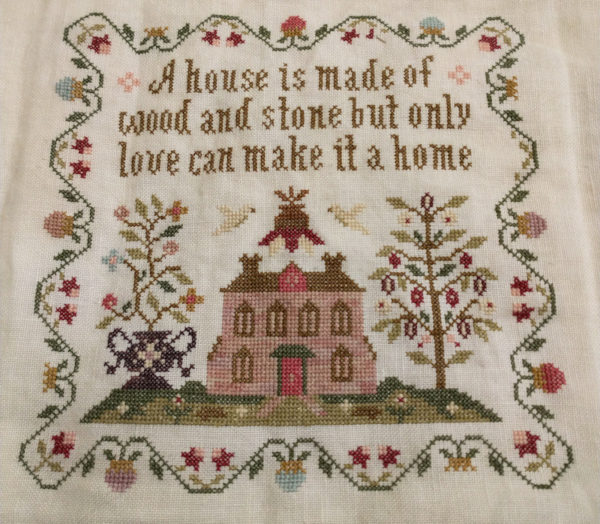
In the above piece, several commented that the birds needed to be restitched in a darker color or outlined. I stitched them so they would blend in to the background a little.
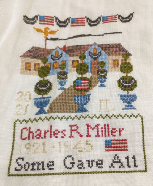
There will be people who will see the Veterans’ Day piece and never notice the dates. Those who care about it and really look at it will notice the dates. Same with the birds in A House Is . . some will never see them; some will notice them first and some will look at it a second or two and say ” oh . . birds!”
You will probably see more stitching in my future pieces that some will think I should have stitched darker. I’m finding I like having a few little pieces that one has to take a closer look to see or .. they miss and never see.

I don’t know if anyone noticed that I stitched my initials and the stitching year in the same light color on the Veterans’ Day piece. Of course, my initials and the stitching date aren’t nearly as important as my uncle’s years of birth and death.

Dottie Newkirk says
I did notice the date and initials and thought they were perfect.
Pat/SC says
Lovely! I like your thinking about 2nd look!
Cherie Moore says
Judy, it looks like you are missing one blue x-stitch on the top right of the right planter. I’m with you about having some elements stitched in more subtle colors. Beautiful!!!!
Judy Laquidara says
Thank you. I’ll check it. I always appreciate y’all finding those things I cannot (or do not) see.
Donnalyn says
Judy, its beautiful and I think your Dad will be thrilled to receive it. I like that you have to look a little more carefully to see the dates and your initials. Great Stitching!!
Linda Garcia says
I like your initials and year in the lighter color, but I think the dates for your uncle should have more emphasis. I think outlining them in a darker color is all that is needed. That way you wouldn’t have to unstitch all the work that you have already done. It would also be more subtle than stitching all the numbers in a darker color.
Donna in KS says
I do like your thinking in most cases! I did see your date and initials right away and was somewhat surprised by them. I actually like your product better than the cover shot to sell the project! I had put my suggestion regarding the dates in two or three posts back (getting too far behind again). I would only back stitch/outline stitch in a darker tan/brown or totally leave as it is. You’ve done a lovely job!