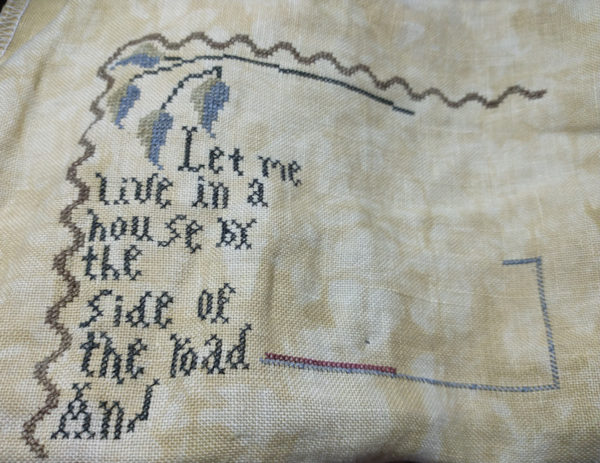
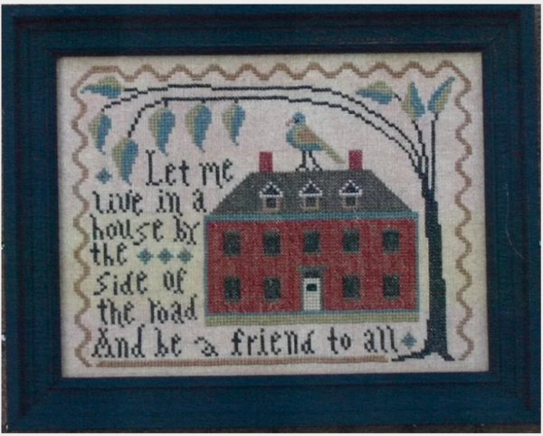
Yesterday a blog reader/friend wrote me and kindly said “I think there’s something wrong with the “S” in house.

I looked at the chart, looked at my piece, counted stitches. No . . it looked fine. I glanced at the picture of the stitched piece and sent that to her. She wrote me back with a bit more detail about the placement of my “S” so I copied just the word “house” from the chart and sent that to her. That’s when she realized the chart isn’t the same as the stitched piece.

I like the stitched “s” better and may go back and take mine out and re-do it. Or . . I may just leave it. Once I get a bit farther along, I’ll decide. I’ll have to count stitches and make sure it will fit and not leave any weird gaps.
I know . . it’s my decision but what do y’all think?
Thanks, Teri, for catching that and for writing me. I guess now I need to start comparing the picture to the chart on future projects. . dang it!

Christina A Coats says
HI Judy Love your stitched s in house as well as the a on the bottom line. Me, I would leave it as is. Just to say I love the shades you used on the leaves, they’re gorgeous.
Diann Smith says
Your work is always nice but I’d vote to fix it.
Sandra J Rea says
It’s a very sweet message and I wish I still did cross-stitch, but I have a question regarding the single “a” in the bottom row? Why do you think it isn’t charted like the other “a’s” so they would all match?
Judy Laquidara says
I think the whole thing is meant to be a bit whimsical. So many charts have different “fonts” throughout but I’ve never noticed one where the chart had so many differences from the stitched piece shown on the cover. That could be because I haven’t stitched that much though .. who knows.
Glynna says
the s is fine, it is the u that is wrong
Judy Laquidara says
Neither are “wrong”. I stitched it by the chart. The one stitched for the picture was stitched differently.
The “S” in the picture starts below the “u” and ends even with the “e” while the “S” in the chart (which I stitched) starts over one from the “u” and ends over the “e”.
The only difference in the “U” in the picture vs. the chart is that the top left of the “u” curves out.
Julie says
I think I like the “s” in their picture best, but when no longer comparing the 2, either will be fine.
Judy Laquidara says
Thanks! I hadn’t thought of it that way. I’m inclined to leave it since it’s stitched correctly according to the chart.
Liz says
Could the problem be the “u” next to the “s”? There is an extra stitch (5 up) and a stitch going to the left in the completed sampler. Would that make your “s” look off?
Check out the “a” on the last line – it leans to the left where the other lower case “a” are up & down.
There are other letters in the complete sampler which do not agree to other letters in the same piece – check out the “n”, “d”, “h” Some are taller, have an extra stitch, or whatever. But doesn’t that add to the charm of the piece – no one is perfect.
Judy Laquidara says
If I started second guessing every part of every chart, I’d never get anything done. In general, especially on antique reproductions that were done by children, there are always mistakes and most people will leave them as written. I’ll think about it and decide when I get finished.
I’ve checked and rechecked and all the letters that look different on my piece are stitched exactly according to the chart. Yes, that “a” on the last row is crazy but at least the stitched piece matches the chart.
The “d”s are all crazy. The one in road looks kinda normal. The one in And on the last row is way tall and the one in friend is way short.
Liz says
.. Sorry if this ends up being a duplicate post –
I think part of the problem is the u in house – it appears to have more stitches as well as a slanted one to the left. But, there are many letters in the sampler that do not match. Check out the different h, r, a, d, l, and so on.
I think the charm of the sampler is the imperfection of it all.
Rebecca says
Reading your explanation of variations, I think that it’s all part of the charm. However, the S already leaves extra space in the word. IF you move it (both left and down), you would want to move the E also, but the spacing to “by” would be great.
Judy Laquidara says
Both variations of the “S” takeup the same amount of space. The one in the photo starts under the “u” where the one on the chart ends over the “e”. No changes would have to be made in the “e”.
Rebecca says
I see that now. Makes it easier to change the S, if you feel the need.
Nelle Coursey says
Must be something wrong with my eyes because I think your s looks just like the one in the chart!
Susan Nixon says
Considering it’s folk art anyway, I’d leave it alone.
Debbie says
I don’t think it’s “wrong”, just different. I don’t think there’s anything to “fix”. Looks fine to me.
Dotti Wahlers says
AMEN!