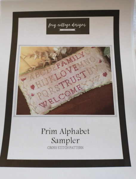
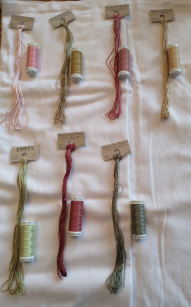
This is a fairly small chart that I’m using for my first conversion from called for colors to Sulky 12 weight thread. The chart is Prim Alphabet Sampler by Frog Cottage Designs.

I’m really drawn to the pinks/roses/greens.

The called for flosses (is flosses a word??) are the ones that are longer and the Sulky is on the spools. The only color I’m not sure about is the green on the bottom left. It’s a little lighter than the called for color but I’ll keep it in the lineup til I decide which fabric I’m going to use. I’ll make the final decision once I lay them all out on the fabric.

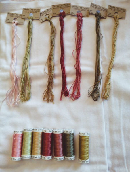
Just a different layout – called for colors on top; Sulky colors on the bottom. Pretty good match except maybe tha tone green, which is second from left in this photo.
Thoughts??

Joyce says
I think the lighter green will be fine. If you have a scrap of fabric in the color you are using maybe you could do a few sample stitches and see how it looks.
Judy Laquidara says
I’ll just make a few stitches on the real piece and if it doesn’t look good, it’s easy to rip back and change colors.
Teri says
The colors are almost the same except that green…I’ll bet it will look fine.
PegD says
I like the green. Most colors are medium value so having a lighter one makes a good contrast. Or does that only apply to quilting?!?? Anyway it looks good.
Judy Laquidara says
I have no idea. I’ve never been much on the rules – just do what I like. I’ve seen quite a few charts where one color is almost so light you don’t even notice, especially in reproduction samplers. I’m not real crazy about having a color you can’t see but if it’s just light, I’m ok with it. A lot depends on the fabric I use so I’ll make a few stitches and see how it turns out.
danielle says
Would this be a good August project – the one where you are trying new threads or fabric? Or have you used the Sulky thread before?
Judy Laquidara says
I’ve used Sulky.