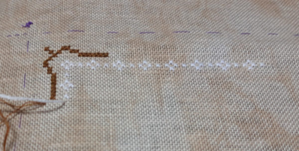
This morning I started stitching on Farmhouse Christmas. The fabric suggested is Studio Line’s Portobello. I have several pieces of Portobello, but neither are by Studio Line (which I haven’t seen at the online shops where I’ve been buying), but the ones I have are more gray. I had wanted to use the Vintage Country Mocha, which I really like and it’s brownish but . . the white isn’t showing up as much as I’d like. I started the outside border thinking the dark might cause the white to brighten up a bit but it didn’t. The white is actually Classic Colorworks’ Bamboo, which is very close to white but not bright white. I grabbed a skein of white DMC and stitched a bit with it but it didn’t make any difference.

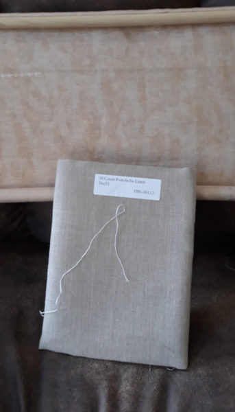
The only other full yard piece of fabric I have is a 30 count portobello and 30 count is what’s called for. The above piece is 32 count. Two little squares per inch doesn’t make much difference but I do prefer the 32 over the 30.

The portobello does look gray, doesn’t it?

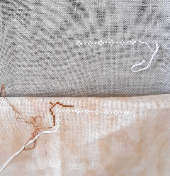
I went ahead and stitched on the gray and I guess it shows up better. I like the mocha color better but I do want my stitches to show.
I’m going to let this one sit for a day or two while I spend too much time staring at it trying to decide and I’d appreciate any thoughts you have.

Joyce says
The white does show up better on the grey. Could you substitute in a color other than white? I don’t remember what the pattern looks like, so if the white is used for snow a different color would not work.
Dotti Hossler says
The gray looks better, the mottled fabric seems to distract. My opinion, you’ll do what makes you happy. Fourteen inches of snow in CT so far and still snowing. Too tired from shoveling to do any handwork.
Dotti in CT
Cheryl Mink says
Yours does look gray. I have the 30ct Portobello Linen called for & mine is definitely not gray. Could you try stitching w/3 strands on the mocha? Downside of that would be you’d need more of the Bamboo.
Judy Laquidara says
Two strands looks thick so I know I wouldn’t be happy with three strands. As it is, I think it calls for 5 skeins of bamboo. 🙂
Cheryl Mink says
Ok, I wasn’t sure how many you were using. I do hope you find a substitute that makes you happy.
Liz says
When I looked back at your photo of the farmhouse cover, the single line of white does not show up that well and that may have been planned. But, the blocks of white for the houses are much brighter. So, you may want to stitch a block of white to see if it looks better to you. And, compare it to the pattern cover.
You may want to stitch some of the other colors to see what works overall. Is there such a thing as a crossed stitch swatch – doing stitches in all the major colors to see how they work against the fabric?lizeagan@swbell.net
And, the gray may be better for a larger design vs the individual ornament option. The frame in the pattern cover has a brown/gray wood options and that may be an option for framing if you use the grayer fabric.
BTW, are you planning to do the ornament size? It would be fun to stuff the ornaments with a scented pine stuffing to give your tree a natural scent.
Judy Laquidara says
I’m more concerned with having my stitches show up (there are a lot of them in those white borders) and not so concerned about how well it shows up on the pattern. If I’m going to do that much work, I want to see it. Definitely the blocks of stitches will show up better. I can spread one strand of floss on the fabric and barely see it but lay the whole skein down and it’s quite obvious.
Not doing the ornament size.
Ruth Chow says
The model that Denise showed barely showed the white. I thought it might have been woven into the pattern. So it is an accent and needn’t be too visible, I think.
Linda B says
The gray is beautiful too. Kind of like a gray winter day. Which background do you think will look better where you plan to hang it?
Denise Russart says
Sometimes you just have to stare it down for a while to decide what you want to do. I like your first fabric choice but I’m with you – not going to do all that stitching if it won’t show up. I do like the gray fabric too so I’m no help.
Susan Nixon says
What about changing the color of the floss instead of the background?
Pam Thorne says
Try DMC B5200 for your white. It is a brighter white and will show up better.
Julie says
I was going to suggest the same thing. I just swapped out the DMC White for the DMC B5200 and it was just enough to make a difference on my project.
Judy Laquidara says
I have one skein but I can get more of that so I’ll try it tomorrow. Thanks.
cindy says
when i look at the middle picture taken from further away i can see that the stitches are there, although my vision wouldn’t allow me to see what the design was if i didn’t know what it was. I like Pam’s suggestion to try a brighter white before going to the gray. I am not big into mottled colors myself, but that is your first choice and i think i would try a different thread before i would give up and change fabrics. I don’t know about the Hobby Lobby or Joanns (or other shop) there, but I suspect they would let you call in the order and pay for it over the phone and then bring it outside to your car so you wouldn’t have to go in the store for it.
Nelle Coursey says
I am with you. I like the way the white shows up but you have to consider the entire pattern when you are doing this. Will all the other colors look good on the gray? Will you like it or will you always wish you had used the other color linen? It is always up to you and not others as to what you like and want it to look like.
Laura says
I do like the portobello.
Beth S. says
What about tea or coffee staining the Vintage Country Mocha to slightly darken and even out the colour?
Rebecca says
I like that idea.
You’ll be spending a good amount of time on this project, so you should really like the fabric you’re doing it on! I agree that the stitching does show more on the gray, but the pattern picture doesn’t have a brightly clear border. I would keep trying your preference, by either darkening the fabric or trying that brighter thread. Good luck!
p.s. You may have less trouble deciding when you are better rested and more comfortable with what is going on.
Cindy F says
I like the mocha but since I can’t remember the design I’m not sure how it all looks together. To me the white doesn’t stand out a lot in the first photo but in the second with both side by side I like the way it looks on the mocha more than on the other.
danielle says
1. You could do a coffee overdye and see if that gives you more of the brown,
2. There is a DMC white that is a brighter white and now for the life of me I cannot remember the number…..B something….there it is, B5200. I was only able to find mine on Amazon because apparently it is quite popular. And I was surprised at how much of a difference it made!