Everyone (or everyone when I last looked) voted against the peacock, in favor of the dragonfly. I agree. I wanted to use the dragonfly but wanted a second opinion.
While i was sitting last night working on Addie’s second sleeve, I thought about another yarn that might work for the peacock buttons.

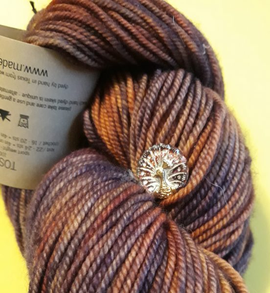
It’s a good match as far as the colors but the button gets lost on the yarn.
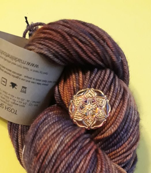
Then I saw this button in the pile and auditioned it.

Perfect! That yarn is also Madelinetosh Sport and the color is Firewood.
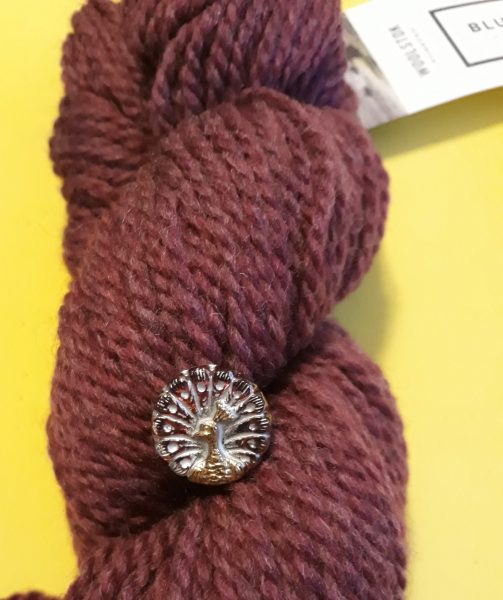
Lucky for the peacock, another yarn was in sight and it might work for the peacock button. I really want to use that button!

That’s Blue Sky Fibers’ Woolstok and the color is Pressed Grapes. Have I found the right yarn for this button? Only problem is . . I think I’ve started a sweater with this yarn and it’s a pullover. Maybe if I haven’t done too much on it, I’ll rip it out and come up with a cardigan so I can use these buttons.

Valerie Zagami says
Yes something solid like the pressed grapes shows the adorable peacock much better. Was also wondering about navy blue. It does deserve to be shown off for sure.
Cherie in St Louis says
What about a gold yarn to show off the peacock?
Ruth says
Perhaps use the peacock buttons as a design element…?
Cindi says
How about a lighter color, so the buttons stand out?
Rebecca says
Yes, I like the idea of matching the yarn to the button! And it definitely stands out more on a solid, especially a dark one like pressed grapes. I look forward to your decision.
dezertsuz says
I do like it on the first yarn, because the white stuff on the button (or yellow or whatever it is) helps it stand out. The other button is good, too. It might be too blendy on the last solid, but it is pretty.
Nelle Coursey says
No I like the new colors from the other post here!!
Ethelann wood says
Hi from ethelann, I always enjoy buttons as a pop on a sleave or at a side seam.