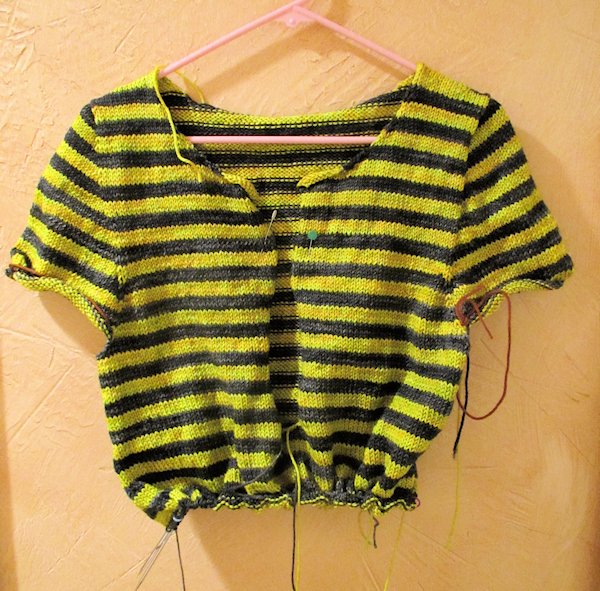
Kynance Cove is a project I started in April. I’ve been pretty good about finishing projects before starting something else but for some reason, Kynance Cove got put aside. I picked it up last week and am determined to finish it, though I will probably put it aside tonight to begin on another test knit for Laura Aylor.
Here’s my dilemma. There’s a button band and a neck band yet to be done. The sweater buttons down about halfway. The colors used are:
- Maple Leaf – the limey green
- Faded Parka – the grayish green
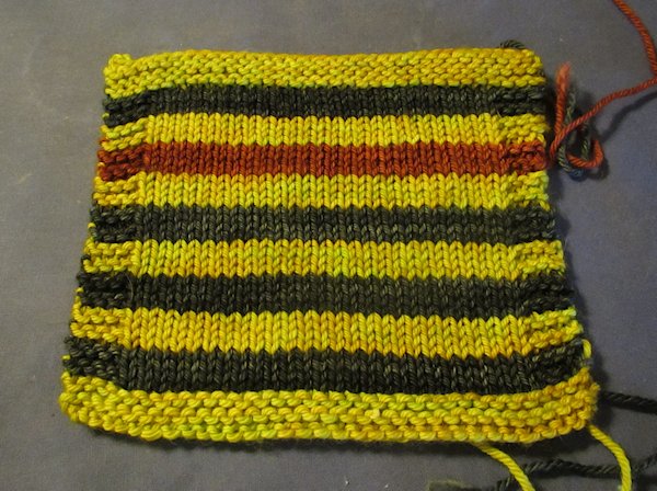
- Ember – orangish red
You can see the Ember in the swatch.
For the button band/neck band, here are my options:
- Maple Leaf – I don’t think this is a good color to wear next to my face.
- Faded Parka – This would work and I’ll probably wear a light gray shirt of some kind underneath this sweater.
- Ember – There will be one Ember stripe near the bottom and I think using it for the button band and neck band, it might work but I don’t want it to look like “Oops . . I’m running out of yarn so I’ll use this one!”. I have plenty of yarn.
Another option I’m thinking about is this: Use ember for the right side of the the button band. That will be the “underneath” side, or the side that has the buttons on it. Then use the faded parka for the left side of the button band and the neck band.
Thoughts??


Judy S says
I’d vote for using the grayish green for the button bands and any ribbing if you have enough yarn. To me, to add the orange red for those to the mix would make the button bands, etc., stand out. Whichever you choose, gray green or lime green will make that color seem like the main color, I think. Love how the stripes line up! Nice job.
Deborah A. says
I do like the darker Faded Parka. Button bands and bottom rib tend to sometimes get soiled easily, so that’s my reasoning. It may only make sense to me, though. By the way, I am going to leave a “wish list” near the laptop in the hopes it will be noticed. I’d really like a set of interchangeable needles. Are the Hiya Hiya needles still one of your favs?
Deborah A. says
Hubby just got new glasses but still needs shopping help. 🙂
Erin says
I like your last paragraph/option! Also think Faded Parka is great for the bands or the Maple Leaf! No matter what it will be nice! If you wear something gray underneath it, then in your mind what color do you feel comfortable with that will pop so the grays(under and on the bands) do not blend in unless that’s what you want! No matter what Judy you do a great job and it will be fabulous!
Sherry V. says
I would leave out the Ember. . . . since you don’t have it in any other part of the body I think it might always look like a substitute. It might look like making the border of a quilt using a fabric that doesn’t exist anywhere else in the piece.
Good luck!
Judy L. says
The ember will be used later in the sweater.
Karen says
I think I’d like the Ember for the button band – gives the sweater a little pop. Love your yarn choices.
Janet says
I think the neck and button bands should be done in the grayish green-to me, dark finishes make the sweater look done. Amber colored buttons would be a pretty touch
Melody says
I would choose the darker color. I know it will be beautiful.
Judy H says
I like the last idea you had about using Ember and Faded Parka together. I think that would look really nice!
LadyBaltimore says
Yep, I like your ideas for the colors (Ember and Faded Parka).
Carol says
Ember and faded parka for the button bands
Dorothy Schreyer says
I like the idea of using the two colors in the button band, but I have seen ready made with a different color band, so the ember by itself would work too, imo
Amy (Waunaknit) says
I like the Ember/Faded Parka option.