Choosing fabrics for quilts is never much of a struggle for me. Stop laughing! I know what you’re thinking . . that I should struggle a bit more! 🙂
I know what I like. I know what I like to use. I don’t worry a whole lot about what others might think about my choices. Getting to that point . . not being callous about the feelings of others but not worrying about what they think, whether it be about the color of my hair, the lack of polish on my nails, the age of the car I drive and so many things . . right up to the fabric I use in my quilts . . is probably the single thing I can pinpoint that had the most to do with my happiness and feelings of self-worth. But, that’s another blog post for another day . . or maybe not. For years, I would go to the quilt shop and let the ladies in the shop have more input in my fabric choices than my own choices. They always chose nice colors and the quilts were pretty. But I love the quilts I make now using the colors/fabrics I choose.
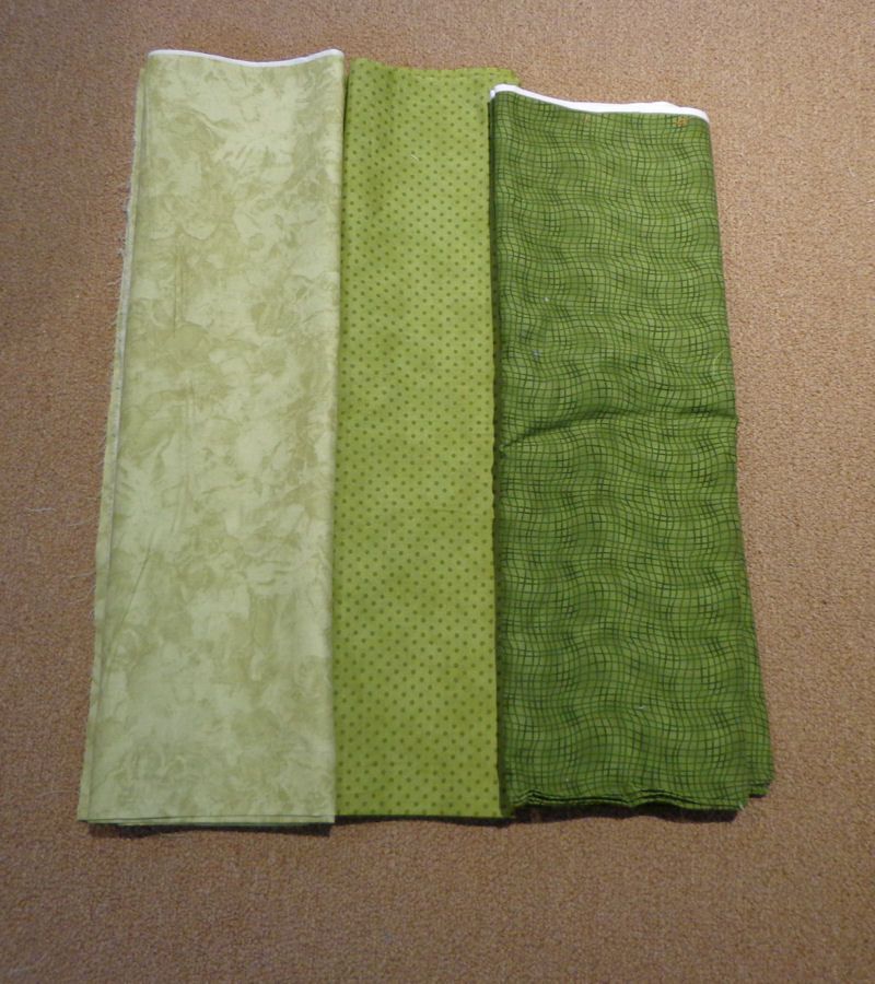
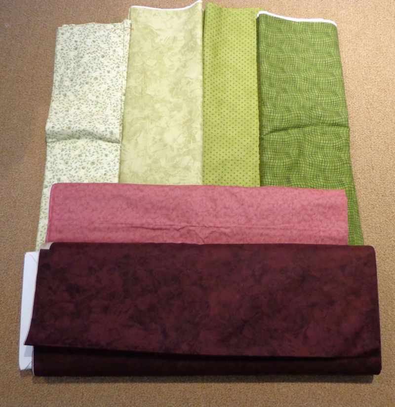
For the fabrics for the Road to Round Rock top, my suggestion is to start with the three main colors. In the first example, and in my own quilt, it will be green. Three greens, a light, medium and dark, are needed. Start with whatever fabrics you’re using . . it might boil down to finding three fabrics that are the same color but in light, medium and dark. These were the first choice.
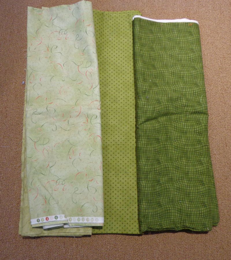
I also added a different light green just to see if it would look any better but I think my first choice is what I’ll use.
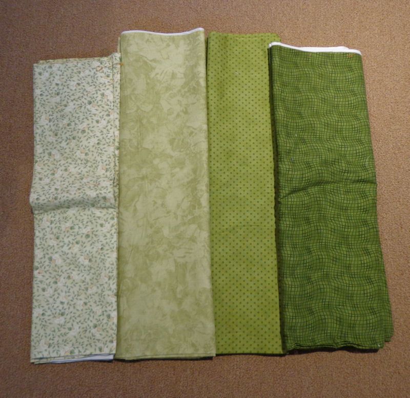
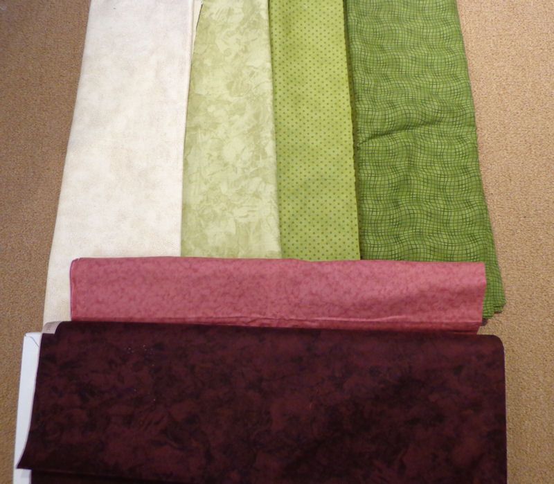
Next, I chose my background.
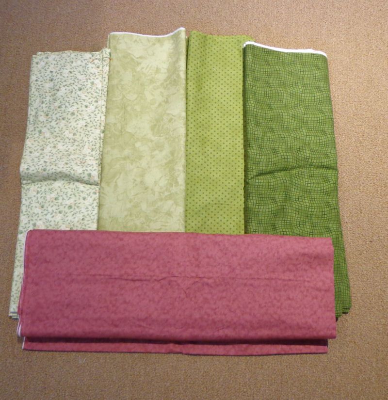
Next decision was what accent fabric I would use. My preference was a rust but I didn’t have anything that really worked. Using the pink definitely takes it out of the masculine realm.
The final choice would be the darkest fabric.
The more I look at the choices, the more I dislike that print for the background. Why can’t I use a print? Why is it so hard for me?
I think I like this combination better. Since there’s so little of the background fabric used, I may force myself to use the print but maybe I won’t. Why do I have to use what I am not comfortable using? I don’t have to do it but some day, I really should learn to use prints.

Micki clemens says
Funny, but I like the plain background also. I also find that I have a hard time picking prints-I’m just not good at mixing them!
Becky says
I like the final choice too. I think the print was too busy for the background…..but what do I know! 🙂
Susan says
I think the print is not the right choice, you’re right. I think it has something to do with feeling the background isn’t as sharp with the print – it muddies things. A print with more background, not so busy, maybe. I like your final choices.
Jill of Apple Avenue Quilts says
I agree that the print was not working. In the pictures it came across as too close in value to your light green . The lighter choice was much better. Love your blog!
Gwen says
I like the last background. The print reads to close to the light green for me.
JudyL says
The background doesn’t touch the light green though so it would have been ok.
Cassandra says
Love that last combo. Thanks for sharing your thought process!
Stella Nemeth says
I prefer the final photo. I don’t think the print would work as a background fabric. I”m going to have to start to figure out what I’m going to be working with.
Irene in NC says
I guess I’ll be the lone voice of dissent on this one – I like the print…but, having said that, I am a firm believer in “it’s your quilt and you have to be happy with it” – we all have different tastes (not better, not worse; just different) !
Janna says
I too find it easy to chose fabrics for quilts–my friend Gina who I am teaching to quilt has a terrible time but she is learning–pick one fabric you absolutely love and go from there. And unlike you, Judy, I like prints and have a harder time with solids or tone on tone.
Diane @ Pine Point says
So your pink will be Fabric #3 and your burgundy will be Fabric #1? Thanks for sharing how you pick your fabrics.
Helen Koenig1 says
I don’t like the print as your background either. The idea is to draw your eye inward to your quilt pattern – and that print would tend to distract your focus from the pattern. Not all prints would do that – something small – almost a blender would probably work = as long as you wouldn’t be able to see the print in the blender as separate from the fabric.
Mel Meister says
The white “pops” more for a background, but do you want the background to stand out? Maybe you do. The print is actually good with the other fabrics. If you don’t ever try to use a print, you will never know if you would like it or not.
If you have enough fabric, you could try making a few of the background blocks with both the print and also the white and decide which one you like better.
Sherryl says
I adore your final color choices, but I gotta say that I almost always choose some kind of print for my background. You might want to “consider” trying it just once. No pressure! I love that you are happy making things your own way without worrying about what anyone else thinks. Would you talk to my mother please? At 75, I doubt she’ll ever change, but it just makes me crazy how much she worries about what anyone else will think of her quilts, her hair, her cooking, etc. Isn’t it wonderful to be yourself and be happy! I’m with you!!
Gayle Bong says
I like the final background too.I”m in the same boat. You’d think 350 quilts and30 years of quilting It would be easier to use larger prints. One thing I remember hearing in the first quilting class I took – even if I didn’t learn it, was that you should mix the scale of prints. All same scale prints lead to a boring quit. Hmm.I don’t like to stash large or multicolored quilts.too much. I guess that’s what happens if I work from my stash.