When designing my quilts, sometimes the border design falls into place and the border design is clear to me before the whole top is designed. If I audition two or three borders and none of those suit me, I know there’s going to be a border struggle. Often, when I make a quilt that I just LOVE, those are the ones I have the hardest time choosing the appropriate border. With Nicole’s quilt, there’s been about a three day border struggle. There are 28 versions of borders for her quilt. It will be a few days (or weeks) before I get to the borders so, no doubt, there will be more borders.
For now, here are the ones that were considered.
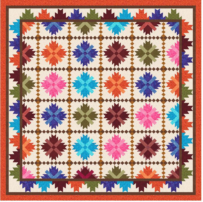
This is the first one that I thought would work but the more I looked at it, the border blocks are too small and too scrunched together looking for my preferences.
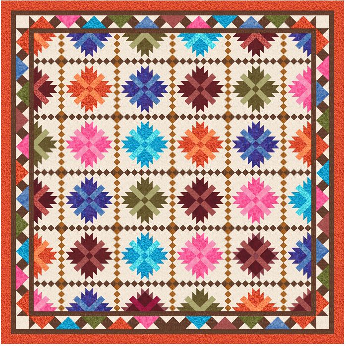
Trying to extend the shape of the bear’s paw blocks out into the border, I thought about this one:
Something about it bugs me. I think it’s because the center of the quilt has more open spaces and the the colored parts of the border are packed too closely.
Looking for a more open border, I tried the vine.
That one seemed like it needed more color. I liked the open look but thought more of the color needed to extend out into the border. I tried making the “vine” scrappy, using the colors in the center but the flow of the vine was lost.
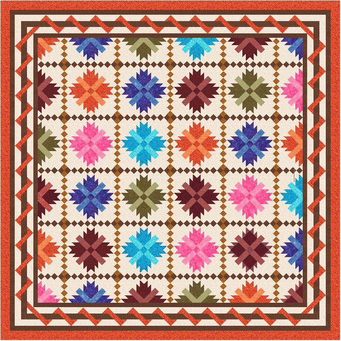
Next is a design that’s in the 60 Pieced Quilt Borders book.
For now, I think this is the border I will use but . . I can always change my mind if I come up with something else.


lynne quinsland says
WOW!!! theya re all lovely and i have no preference….they are ALL amazing!
Swooze says
See I like the second one and if you could alternate the color or stack them similarly to the last quilt I think it would give you that more open look.
Marion Morgan says
I know you nixed it, but I like number one. I don’t think the border needs to be so fancy. The quilt is magnificent that it stands on it’s own. And I love it, lucky girl.
DebbieW says
I am with Marion and I like the first one but any one of them will look beautiful. Your quilt–your choice! Thanks for your blog. I read it every day unless life takes an unexpected turn!
Janet says
Hi Judy! I like the vine border very much- I would change the color to one of the torquoises.. It accents the quilt without competing with your beautiful quilt design.I think sometimes more is just too much.
CindyM says
…just ask my friends… I’m not afraid to state my real thoughts. But I don’t think you have found “the right” border yet. I think it needs to be less distracting from the blocks than any of these are… although I think the 4th one is the closest of any of these. I think maybe the pieced part of the border is too close to the blocks… does that make sense?
Karen says
I agree with Cindy, I don’t think that any of them make it “sing” yet. Tho I do think the 1st is the closest. At least you are taking the time to make sure the border works with the quilt rather than slap one on (like I do! ).
Vicki W says
I like both of the last 2. I think the vine is my favorite but I agree about the lack of color and don’t quite know how to fix that.
Josie says
WOW I too audition borders as I think the border makes or breaks the quilt..I am also quite vocal..too , like Cindy , just ask my friends..LOL While all are beautiful borders..three seem too busy and distracting from the beauty of your bear paws.. I do think the border of woven ribbon is nice but I would add another plain border next to the narrow brown one maybe like 2 in then do the ribbon moving the ribbon out a bit..plus unless special reason for the last border being orange I would tone that down. just my thoughts ..have fun playing..
Sharon Spingler says
Hard choice but I’m for option 2
CelticRose says
I don’t any think any of those borders are quite right; I think you need to keep playing with it.
I think I see what the problem on the 2nd one is though. You’ve squared off the bear paws to fit along the edge of the border and now they don’t match the pointy look of the ones in the center. Also, the bear paws in the border only have the dark color and lack the medium/light color used in the center blocks, so the colors in the border look too saturated.
Glenda in Florida says
Of those four, I would choose the vine. The last one bothers me bacause the pointy parts of the border don’t match/line up with the blocks. If they lined up perfectly, and you could use the same fabric extending out from each block, I think you would have a winner. But, since you wrote the book on borders 🙂 I think you should keep looking. Your analysis of the problems with the others is spot on. I guess that’s why you make award winning quilts–you work at it until you get it right!
Sue in Scottsdale, AZ says
I think I like #4 the best, but there is something about it that bothers me. I think it is that the triangles pointing out are just slightly off center from the bear paws and I find it uncomfortable/distracting to look at. I’m not quite sure what I would do, but I agree with others that I don’t think you’ve found the best border design yet. I know you’ll come up with the perfect border because you always do!
Tracy says
I like the last one also…it seems to be an extension of the quilt and not “fighting” it!
Terri says
I agree with Tracy, it works with it like an extension. Oh, my fav border book as well, made me find you here and I like your style.
Vicky says
Is that the vine that we did on the Strawberry quilt? It was fun to make.
Okay, they’re all nice but I’m not bowled over by any of them. I wish you could make the bear paws extend into the border somehow. I haven’t a clue how, but I think that would stay true to the center of the quilt. I love bear paws. Your center is dynamite!!!
Sandy says
I love the 3rd one (the vine) — Can’t figure out how it’s pieced though.
Doreen says
Definitely the last one of the ones shown. Am not able to verbalize exactly but that last is “comfortable” and “fits” the balance of the center/whole. Just sayin’…..hugs, D
Trina says
I like the first border. Maybe just a solid border?
Trina
gailss1 says
Wow….hard decisions and lots of opinions. Good luck and know that you will make the right decission in the end.
Gail
Loretta says
I like the first choice, because it frames the quilt and draws my eye to the center. Can’t wait to see your final choice, as I know it will be spectacular.
Pam says
Totally agree, but I know that you will find the right one.
Amy @ Just being me says
Just finding this! I like the top border with the squares on point, but using the narrow white border in between (you showed on FB).
Debi says
I’m for the vine too Judy -I think they all look great but No. 3 is my fav. Audition it with other colours perhaps?
Becky M says
I think you will come up with a new design you like better than all of these. I too think the first is too busy too close the the center. The second is too heavy and takes away from the center. The third I like, but maybe in tourquoise as Janet suggests. The fourth has triangles that do not line up with the triangles in the blocks. All borders are stunning on their own and too complicated for me. I have border envy. Curious to see what you finally choose.
pdudgeon says
i don’t know if anyone has suggested this or not, but is there any reason why you can’t just mirror image the half blocks onto the other side of the 1st brown inner border so that the first border appears to interscect the blocks, and then change the 2nd brown border to a blue border, and then add the outer orange border?
KCLori says
Judy, I think you’ve chosen the correct one. As I was looking at each sample, I had the exact thoughts that you did too.
I’m sure no matter what you pick it will be gorgeous!
Roberta says
With border struggles like that might want to consider the fact that the quilt doesn’t want borders and just make more blocks to accommodate the size. Just a thought. Or a simple little two inch border and then a floral outer border. With lots of piecing a quiet border is in order. But I really like the basic quilt and when I do it will be without any borders I think because I like that look with this one.
Hugs!!!!
Donna says
my favorite so far is the first one.
SonyaW says
I really like this quilt. My choice would be number 1. Will you be sharing this pattern with us? She will love it!!!
Britt says
I like the first option but it think it would look more open if you increased the width of the first brown border strip. Then the on point squares would be farther away from the center. Beautiful quilt!
Gale says
When you look at the quilt and your eye sees the border first and you have to make yourself look at the quilt, then the border is too much. I think that is the case with all of these except the first one. It draws my eye into the quilt but the all of the others make me see only the border.
cindy says
i think the bear paw one would look good if you match the colors to the blocks inside. then they look like hearts. i don’t like the last one as the centers of the border pieces don’t match the centers of the blocks and it looks uneven to me.
Susan says
28 is a lot of ones to try. To be honest, I don’t like any of these. The ones you mentioned objections to, I agreed completely. You have a very intense center, and maybe it just needs plain borders or none at all?
Jeanne in Ohio says
I think I’d either go plain or try to emulate the chains in the border, what I call chain of squares, maybe with both sizes of squares.
Kathleen says
I like what P Dud said. I didn’t know how to explain it or if you could even do it. I like things to balance. Since you didn’t ask for advice at least you got plenty to spare. Whatever you want to do somebody already agrees with you. I like that ribbon one a lot. Especially since its a gift and it looks wrapped like a present.
Brandy M. says
I like two of them – the first one, with the small squares, and the last one that you said will probably be “the one.” I like the small squares border because the squares kind of “bring out” and enhance the small squares within the quilt. I like the last one because it’s a beautiful design, has great color, and I like that the corners have interest, too.
Look forward to see what you choose!
BLM 🙂
Sue says
I know you didn’t ask for advice …… Great quilt and great borders, but I feel the two are fighting with each other. I agree with the others that suggested no borders, or something very plain, (or finishing the bear paws in the border)
Sandra Richardson says
The last one does it for me,gorgeous!
Patty says
I like the vines best. The others are way too busy and detract from the quilt. They are confusing to me.
Maxi says
My choice is the first one. Just seems to frame the quilt just right. They are all pretty, though. Love the quilt!
Doe in Mi says
I like the 1st and 2nd. But think you’d like the squares bigger on the 1st then it wouldn’t be so busy. And on the 2nd I saw an idea of making the border colors the same as the inside block they are attached to,(2 blocks the same color) now look at it and you may find you’ve pieced a heart there !!! Kinda neat for someone you love.
Nathalie says
two suggestions: 1) Try making your first plain border a little wider – giving more space between the center of your quilt and your pieced border. Try it with all your options.
2) what about making another row and column of blocks and not adding a border at all?
Cinda says
I would like to see you mimic the sashing design from in between your beautiful blocks in the quilt-with the smaller and slightly bigger squares set on point- in your border space. I think it would keep the look more simpl but tie the qilt and border together.
sandra collins says
Last one my favourite but I do like all.Just show you what a different a border makes
katie says
yep I agree the last is the best.!!
Marion Bryant-Parsons says
Dear Judy,
I am confused. I have downloaded a Nicole Sofa Quilt which was done by the hour but cannot find this beautiful new Nicole Quilt. I love the new blocks & the colours you have used but where can I download the pattern from? I read all your blogs so you can imagine my surprise over the last week’s blog about which border to use. Please help.