I’ve been asked to make a quilt for an auction and I figured something “Texas” might be a good way to go. People in Texas really go all out for Texas stuff. For the most part, quilts just don’t raise a lot of money at auctions so I’m hoping if it has a “Texas” theme, maybe someone will at least bid on it!
Here’s a picture of the fabric I bought last week and I’m thinking of using the black border print and the panel, which are the “Deep in the Heart of Texas” line from Moda. Have I mentioned lately how much I love Texas?
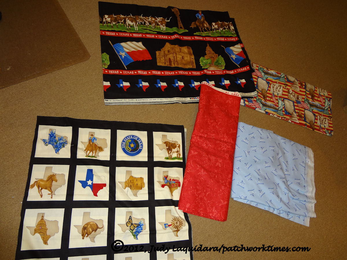
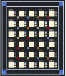
You can see more of the line here. For the border print, there are four different borders, not counting that one on the bottom with the red, white and blue Texas shape. In all these EQ drawings, I plan to cut apart the squares and use those in the body of the quilt (where plain off white sections are shown in the drawing) and then use the border print in place the black border in the drawings. Maybe for corner stones, I’ll add fabric to make those Texas shapes in the bottom of the border print work.
It’s hard to visualize without the fabric scanned into the drawing but so far, these are the designs I’ve come up with.
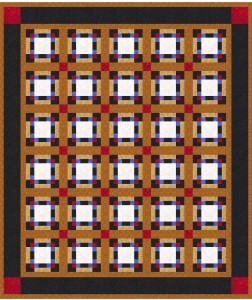
Design #1:
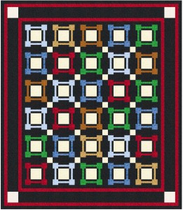
Design #2:
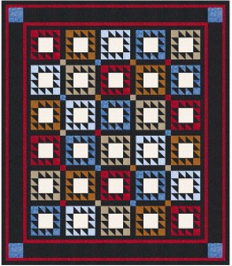
Design #3:
Design #4:
Please try to visualize these designs with the Texas squares instead of the plain ecru squares, and with the border print instead of the solid black wide border. Any one of these designs stand out as something you’d bid on at an auction?

suzanne says
I really love the first one!! I think any way you go will be great!! I have seen this line too and loved it, but could not figure out how to work it into a quilt. Very inspiring!
Regina says
1 or 2 …the other 2 seem busy and would get busier with the fabrics you have…
Lee Ann says
I love #1! My second choice would be #3. Anything you do will be wonderful!
Helene says
Love #2 and would bid on it. I’m sure any of them that you make will be treasured by the highest bidder.
Pam says
Number 1. The buckskin color seems to add more “Texas” substance.
Jeny says
#1 for me – think the others may be too busy once you have the print in place.
Lisa B says
I like #1. It’s one of my favorites. Wish I had the patience to quilt. Your work is so beautiful.
On another note, I recently moved just north of Butler Missouri. Would you mind telling me where the Mennonite store is in Butler and the two Amish stores are? I would really appreciate it.
Linda in TX says
#1 Judy. I do an auction quilt each year for a firefighters’ scholarship foundation. Most have sold for $500 – one sold for $300. If the theme is Texas, it’ll go like wildfire!
Kris says
#3 gets my vote.
Michelle says
I like 1 and 3
Roberta says
I like #3, but then I’m a HST girl. But i do like that block too.
Looking forward to see which one you chose so we can oggle it.
Hugs!!!!
Cindy in NC says
I have some Gone With the Wind, Wizard of Oz, and New Orleans street map fabric that I would like to use (not all in one quilt!) the way you are planning to feature your Texas panels. Like most of the other commenters, I like designs 1 and 2. I can’t wait to see what you come up with so I can copy it – if I can get up the nerve to cut into these fabrics I’ve been collecting.
Judy D in WA says
I really like the simplicity of design 2. It’s going to be fabulous whatever you do.
You may have given me a new idea for the hunting club quilt. 😉
pat says
I like design #2…
liz says
I’d go for #3 and then #2.
Jennifer says
I like #1 and #4. can’t wait to see them with the TX fabric.
pat says
I like the 2 cnd one.
Linda says
My vote would be for #3.
Edie Gorzo says
#1, it seems to say Texas, even from all the way up here in Canada.
Karen says
I like #1 the best.
Melinda in CT says
I think #1 suits the Texas fabric best.
Freda Henderson says
# 1 gets my vote but any one of them will be great.
shirley bruner says
I like #2. i was in Texas for 20 years…you can’t help it…Texas just seeps into your pores. you HAVE to have Texas stuff in your home. my son has cow skulls on his front porch. LOL he might have gone a bit overboard with that. and his main bathroom is all Texas….down to the toilet paper holder of bull horns. Texans are a proud bunch and they can’t help themselves. you are fitting right in.
Beth says
Fyi…the squares aren’t square…about 1/4″ difference one way. Wish the fabric companies would think about this when they design ” squares”
quilterbee says
I like #2 best but any of them would work. With #2 the black sashing gives the eyes a place to rest and shows off the blocks better. I also like the nine patches that form. I think I would go with the number #1 tan strip for the border because if you don’t have red or blue in your room you might pass up this beautiful quilt if you were not a quilter. This way the tan would go in any room color. I really like how you can take the same block even a panel and make it look so different in each quilt design. All the designs are great.
Can you take quilt #2 and put the tan stripe border with it so I can see if my suggestion even looks good? Thank you.
Trina says
I like design #2.
Trina
Donna says
#1 is calming to me. It’s my first choice. Next would be #3. I would bid on either of those. The others for me are a little busy. I’m sure anything you do will be great.
Debbie says
I actually like #3. I think the little motifs might be showcased better in the block. Of course that is just me!
Vicki W says
I love #2 but any of them would work great.
Annie says
Yes, I’d bid on design #3. I see that’s the least popular so far, but I’m also crazy about half square triangles and think they would go with any fabric motif.
Jennifer W says
I like #2. It just catches my attention.
Beckyl M says
I like #2 the best.
terri says
1 & 3 gets second place.
marion usborne says
I’m torn between 1 and 2; 4 is too “modern” for squares.
Megan says
I love #2. The clean graphic lines just SPEAK to me. I would bid on that one!
kathleen says
#2 Shouts cowboy to me.
Marky says
#1 gets my vote.
Karen says
2 or 4 get my votes
Angie says
# 1 gets my vote!
pdudgeon says
yep, number 1 is the one to make. especially when it’s a auction and you don’t know who the quilt will be for, it’s sensible to go with a classic, timeless design choice.
Terri in BC says
I like #2 – it seems to have a modern twist to a traditional layout. I’m sure whatever you make, it will be beautiful!
Sue in Scottsdale, AZ says
I like #1. My second choice is #3.
Debi says
No. 2 gets my vote
Pat says
I like #1 the best…..for some reason, it just says “saddle” to me…..gives me a horse feeling…and that, to me, is Texas! (I know…crazy…but that was how I felt when I looked at that design as compared to the others.)
Deb Praus says
I’ll chime in also….#1 all the way for me. It just seems to have that pop factor.
shrewdkate says
I like no. 4–most contemporary. Want traditional, then number2. Love the Texas fabric.
Diana in TX says
I would say #2 then #1. But I do like them all. I was looking at the texas fabric panel this morning at the LQS.
Cheryl says
#2 gets my vote. I can see words in those borders to liven things up….like “deep in the heart” or “yellow rose” or some other Texas identifier.
Marilyn Smith says
Love #1 – very appealing to the eye.
sharon says
1 and 4
SusanB says
#2 – simple and I love the way the frame colors pop against the black background and the black gives your eyes a place to rest. The others are too busy for me.
Lee Ann L. says
I’m liking number 2. I can see the texas fabric in my mind’s eye and I think that design would be best!
Helen Koenigl says
I like number 1 the best and think it would be really pretty and “Texas-y” all done up.
Nancy Latham says
My first choice would be #2. It seems more lively to me. More movement in the quilt. Second would be 3. Either of these are more interesting to me.
Doreen says
I have tried not to look at other’s responses and chose #2. Sophisticated, will be an awesome frame for the pictures/designs and isn’t so busy as to detract. Using black is always a favorite for me and #2 uses it beautifully. Like the other ideas, but for this one, definitely the second option. Just sayin’……
Patsy says
I like #2. It reminds me of fences/corrals.
Jackie says
I vote for 2. It looks like picture frames.
Ann says
I vote for #1.
Kathleen says
I like #2. But anything you make turns out wonderful!
Stephani Siekierski says
I liked #3 Judy. Something western about all those triangles (anvils??). I like to hear how happy you say you are in TX. I don’t remember hearing that about MO. Like other transplants, you can say that you were not born in TX, but you got here as fast as you could. Stephani in TX (Tomazec@aol.com)
Jan B MN/TX says
Boy…all of these ‘comments’ might make you even more confused as to which lay-out to use! I vote for #1 and #3!!! 🙂
HeideW says
#2 caught my eye first; #4 was my second choice.
Darlene S says
I like #1 and #3 the best. I would bid on anyone that you made because it will be great looking when you are done.
Lynne says
1 and2 are my faves
Gale says
Definitely #2. It will just pop out the colors of the motifs in the squares.
Linda says
No 3 for me!
Cheers
Linda
carol c says
#3 for me as well Judy
whatever you do will be grand
Sara in AL says
#2 is my choice. Will show off the squares the best and make the borders sing.
Mel Meister says
#4
Karla says
Love Love number 1 it gets my vote and yes I would bid on it.
Miss Jamee says
i like 2…
Donna K. from N. TX says
Me, I like #1 and #3. But mostly #1! Can’t see what you decide upon.
Suzette says
I like 1 and 4. I think any of them would be snapped up in a heartbeat.
Elaine says
My vote is for #1
Libby says
I’m voting for #4. I am saving my pennies to purchase EQ because you are so inspiring!
Alycia says
one or two … I think I like two the best – but I like the colors of one the best…. good luck!!
Denise says
My favorite by far is number 3!
Lisa W. says
I vote for #2 – love it!
Sherry Moran says
I like #2 first and then #1. Saw the fabric yesterday while we were visiting Bryan-College Station. Can’t wait to see how yours finishes up!
Valerie says
With so many responses it seems silly to put in my 2 cents but I can’t resist. I like all of them but #3 is my very fave followed by #1. Those two seem to have a Texan feel to them as well(especially #3 😉 )
Thanks for showing all of your wonderful ideas. You are a great inspiration.
Valerie
Jean Greenwood says
I cut the squares and put them in the middle of Astra, then I put Ina few big pieces of material and a 10″ printed square of Texas. Looks good and made the squares really stand out