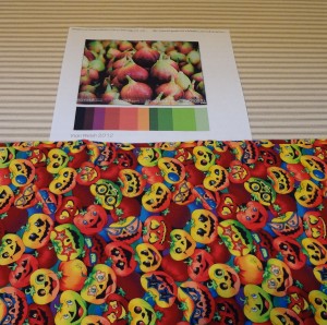
It’s really difficult for me to use anything but tone on tone fabrics. I pulled some prints to see if any of those go with this palette. One is ok . . . not perfect though.
 I think I like this fabric so much that I want it to work but there’s too much of that limey yellowy green. There’s also a lot of blue in the fabric and not in the palette.
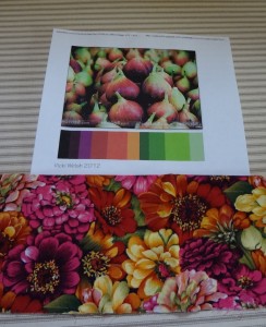
This is probably the best match but I only have 1/4 yard of it and since I like to make big quilts, I’m not sure I could make this work. There’s probably more pink in there than it needs anyway.
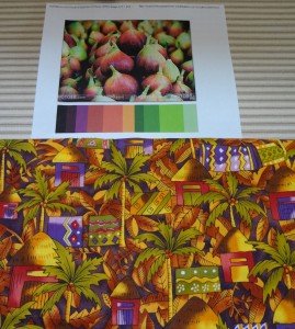
This one has plenty of fabric and I have an idea of what I could do with it but the greens aren’t so right.
Today I’m going to try to come up with a quilt design and then I can make the tone on tones work!


SarahB says
I like the middle one! I think it’s a perfect fit….
Osagebluffquilter says
That Zinnia fabric is adorable!
Doreen Auger says
The zinnia fabric is lookin’ perfect for the palette but the bottom one is more adventuresome! Hmmmm……yardage available-adequate (check), colors meet palette requirements (check). Let’s see what comes out for design possibility/ies. Love the anticipation!-D
June Piper-Brandon says
Judy, I like the middle fabric, it looks great and has the perfect mix of colors for the palette.